Senior Designer · Brand Systems · Editorial Direction · New York
Theo Thompson
I don't design for attention. I design so your brand looks the same whether it's on a billboard, a business card, or a vendor's proof.
Brand systems, editorial direction, and visual governance for premium and global brands.


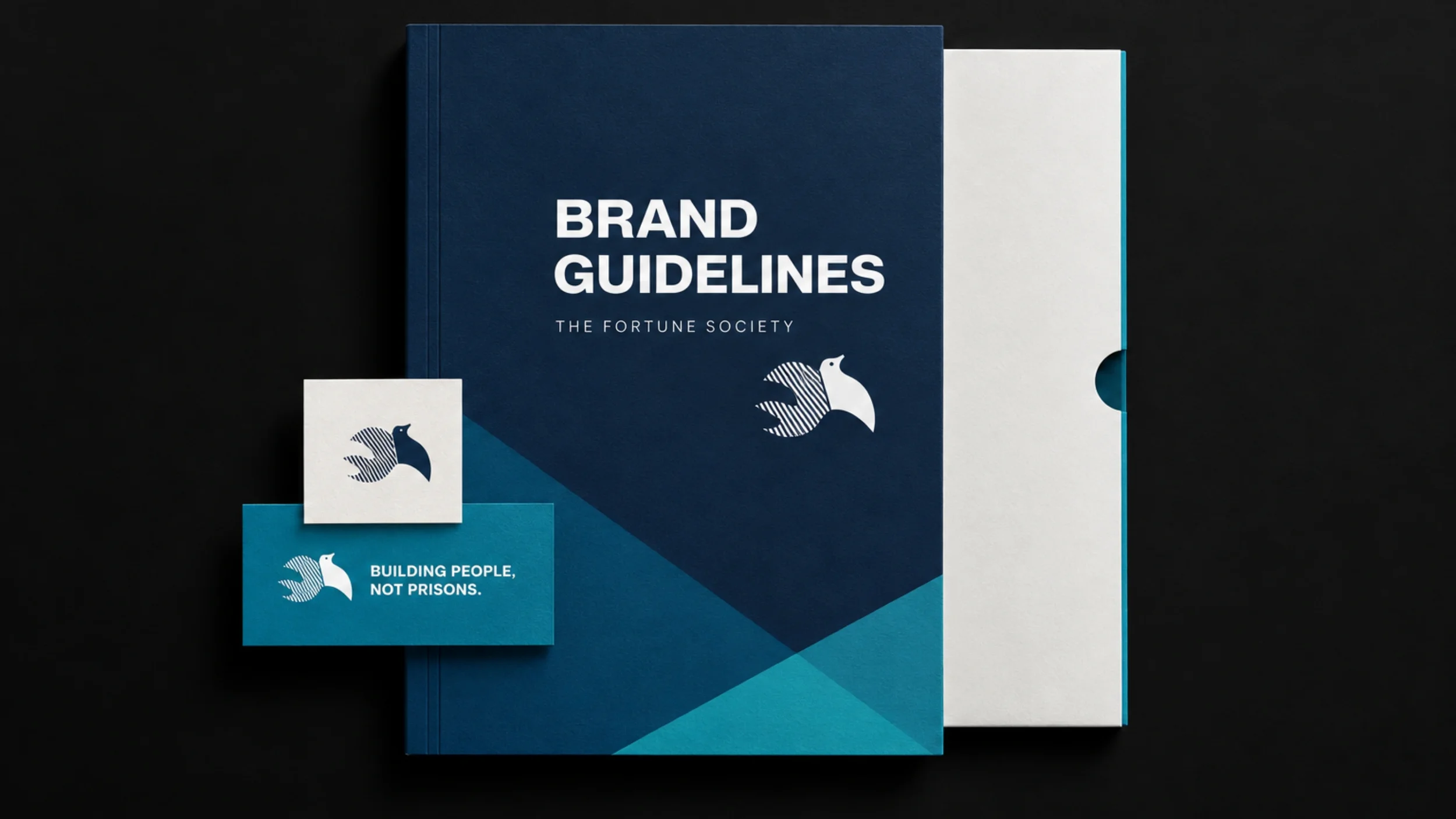

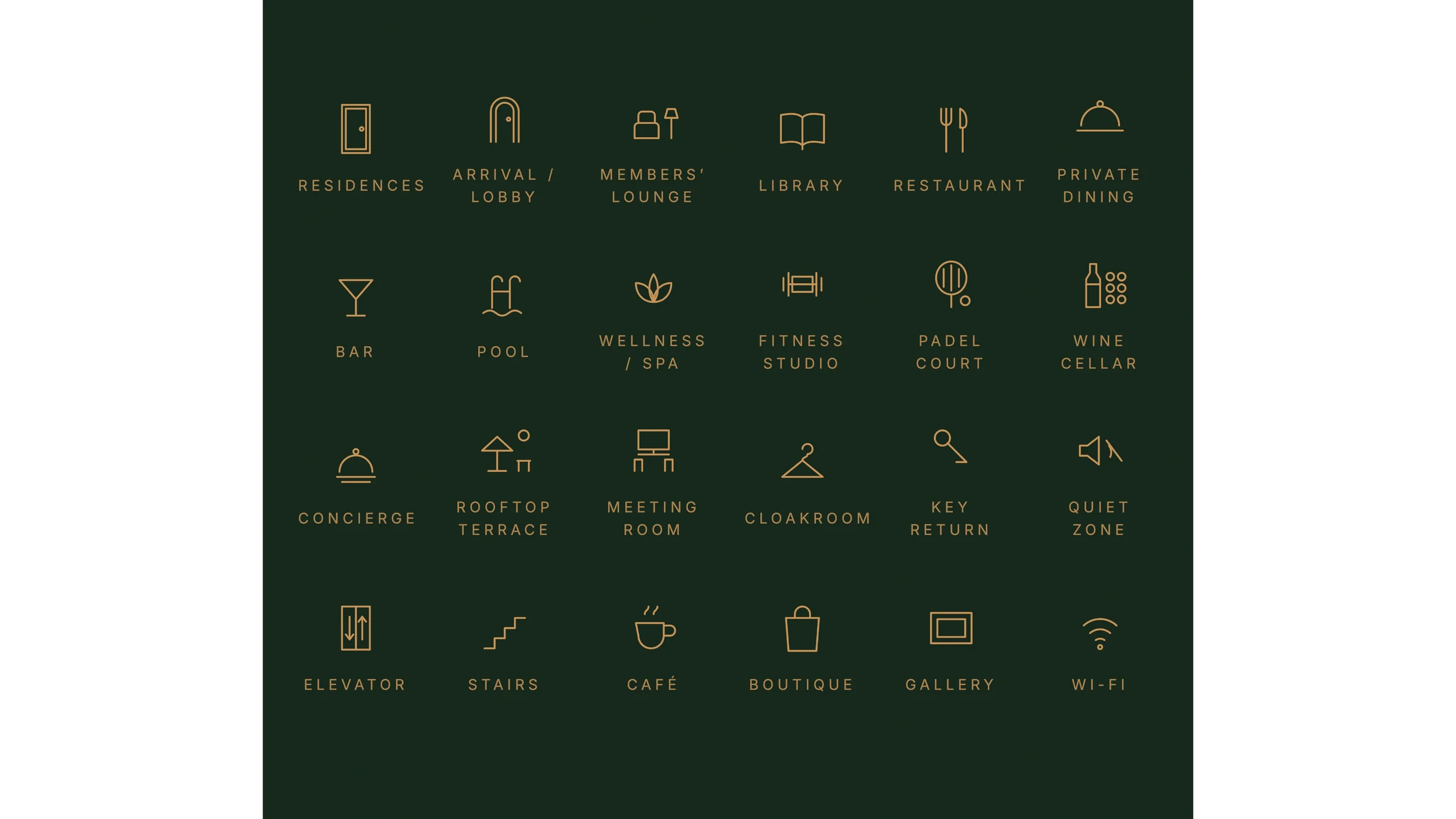





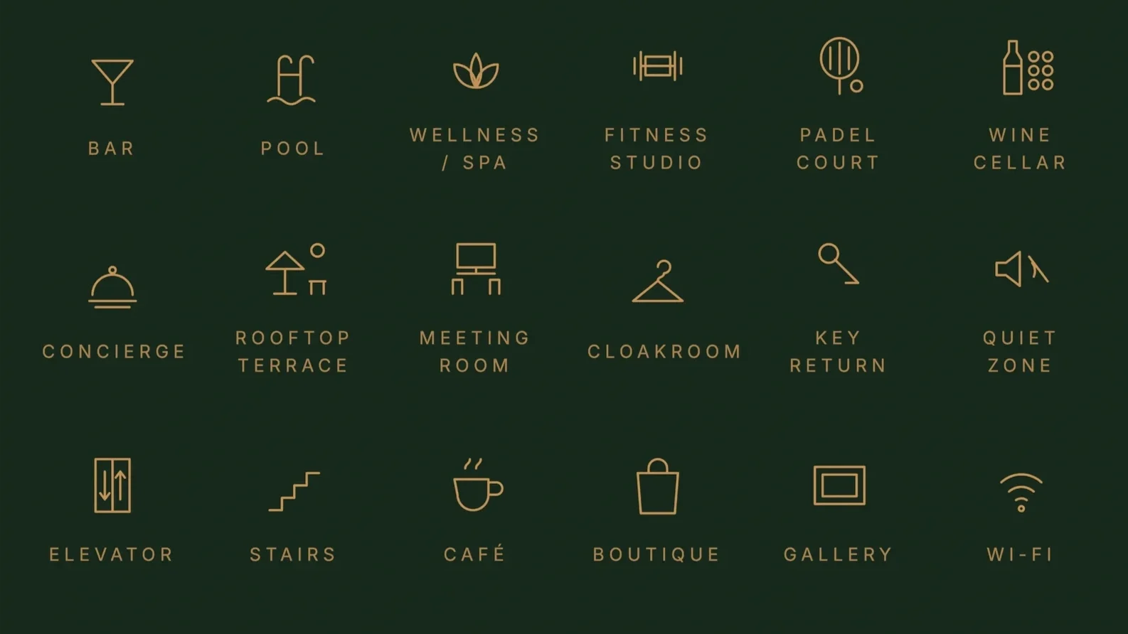
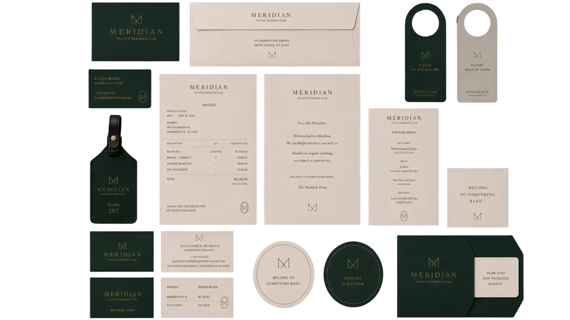
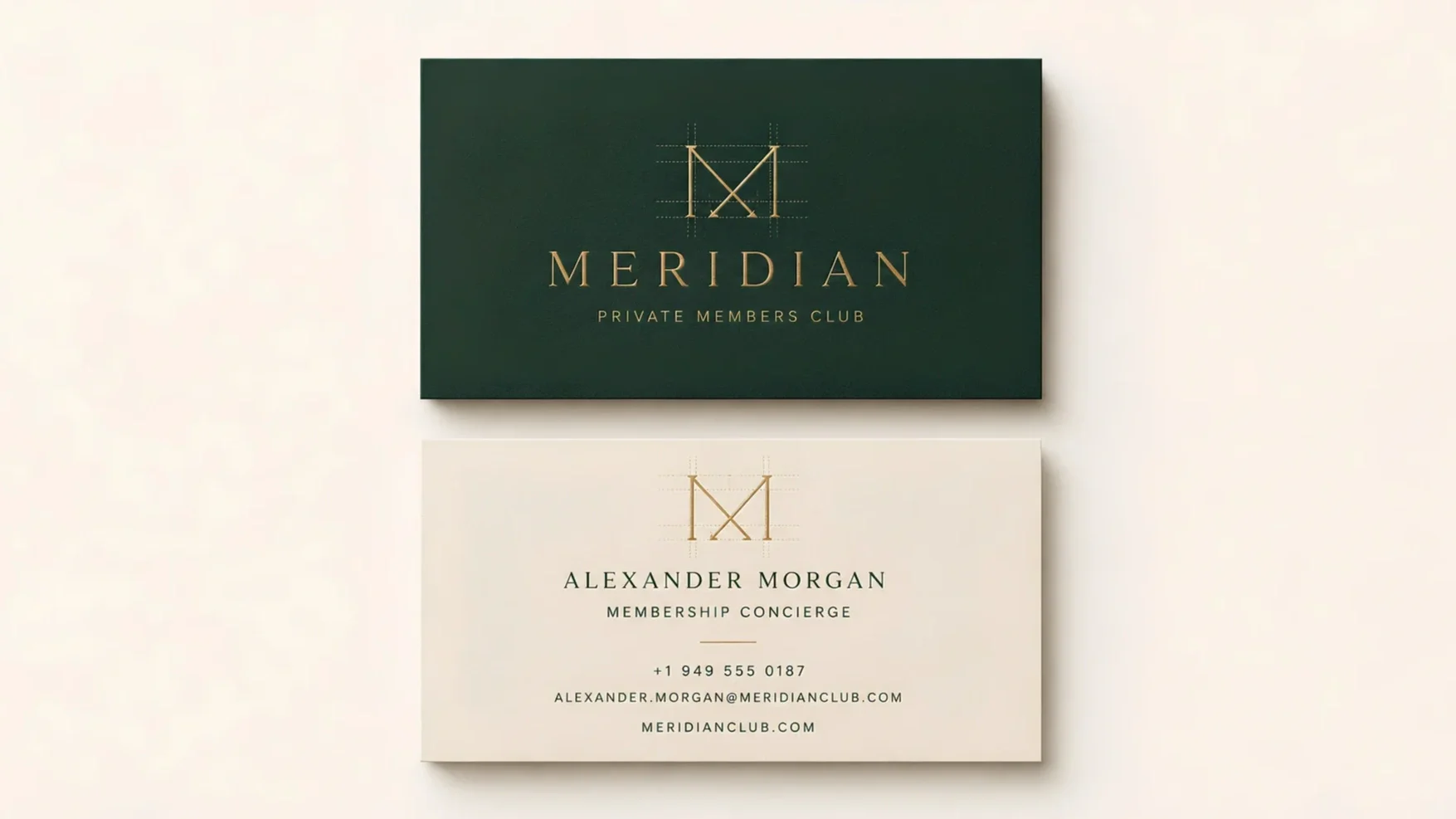









The difference isn't decoration.
It's the system.
Drag to compareSame brand. Left: styled by feel. Right: built as a system that holds anywhere.


Build
Identity architecture, typography, image direction, and layout systems, that create clear visual standards.
Document
Guidelines, templates, vendor specifications, and editorial rules that make the system easier to understand and repeat.
Deploy
Campaign adaptation, production oversight, and multi-format rollout across digital, print, presentation, and environmental touchpoints.
Built for consistency
systems that holdDeploy without drift.
after the launch momentWhat collaborators say
kind Voices“Theo spearheaded a major update of our branding guidelines that helped empower staff members across our agency.
His commitment to excellence and contributions to our organization were invaluable.”
EMERSON SOTO
Design Director
selected references“Theo translates high-level brand vision into precise production reality.
His bulletproof files and rigorous vendor specifications ensure complex campaigns deploy flawlessly at scale.”
“Theo is a true steward of visual identity.
He builds and governs the precise systems that keep a brand consistent, elevated, and uncompromising across every global touchpoint.”
whitney PITTMAN-RAMOS
colleague
Pete MILO
VP, Print & VISUALS The person.

I chose design deliberately.
Growing up between New York and the suburbs of Washington, D.C., I became attentive to the visual language around me — advertising, storefronts, architecture, magazines, public spaces — and to how an image or system shapes the way people experience a brand…
aboutTheo Thompson, New York